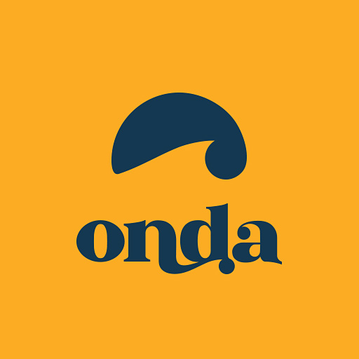
The Logotype
Our primary visual identifier. The wordmark combines structure with fluidity.
Structure & Flow
The "Lagree Onda" logotype represents the core duality of the method. "LAGREE" acts as the stable foundation—strong, serifed, and uppercase, tracked widely to create a base.
"ONDA" (Wave) introduces movement, featuring a custom ligature where the letters flow into one another, mimicking the continuous tension and fluid transitions of the workout.
folder_zip Download Logo Package
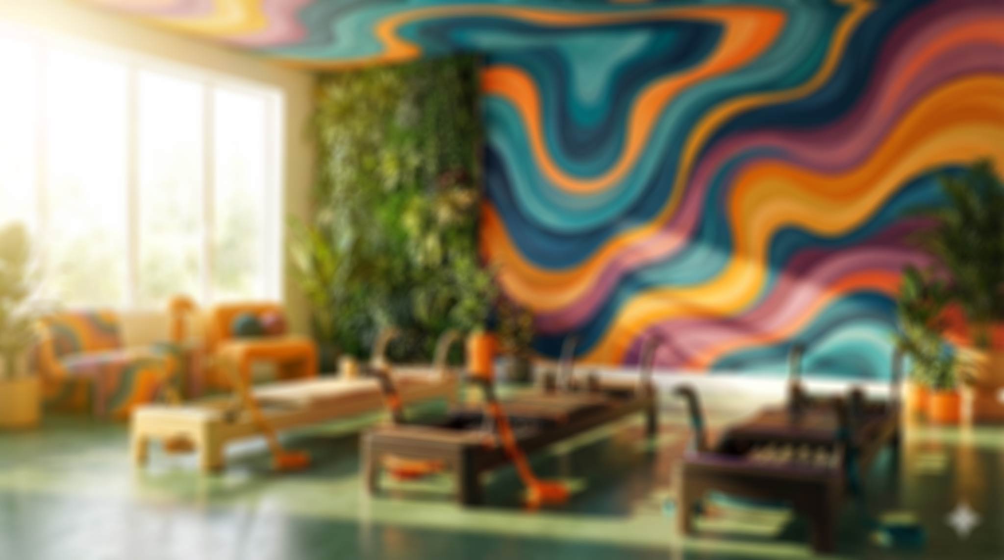
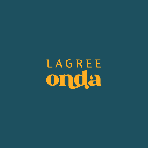
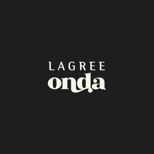
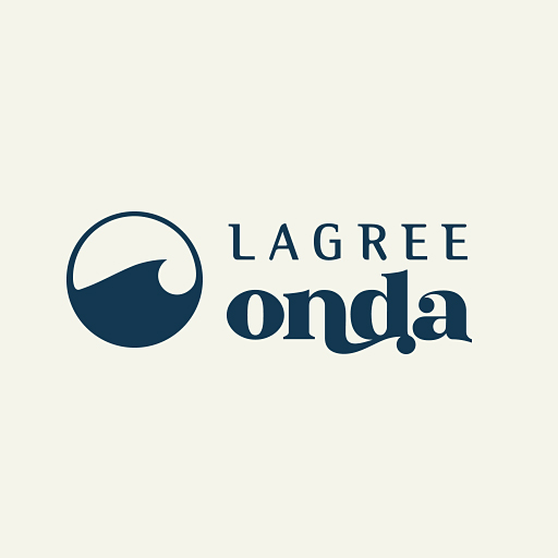
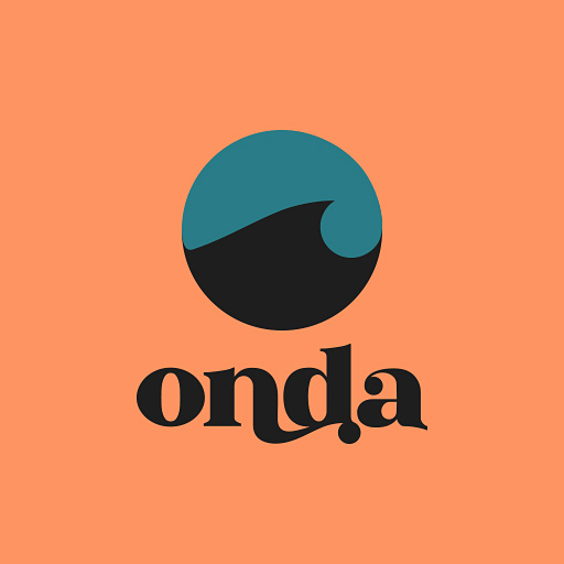
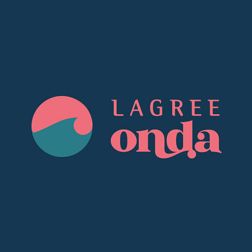
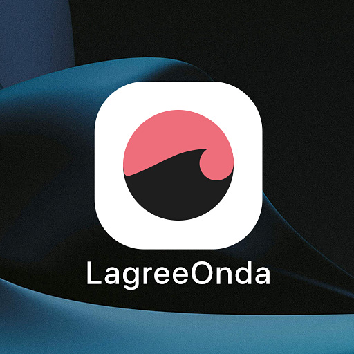
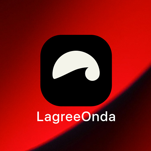
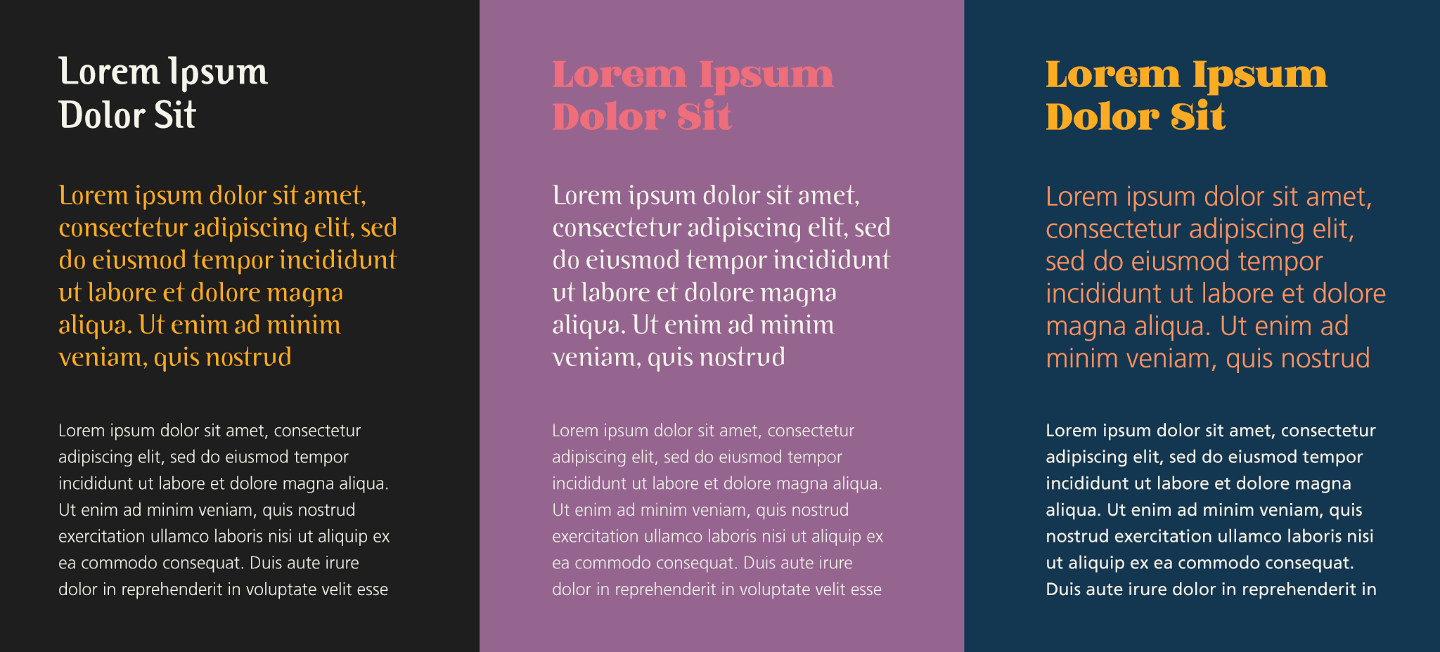
Brand Gallery
Swipe to view all approved colorways for various backgrounds and merchandise.
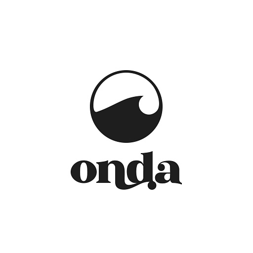
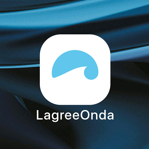
The Icon
The "Onda Wave." A symbol of infinite resistance and continuous motion.
Zooming In
By extracting and zooming into the ligature from the wordmark, we reveal the "Onda Wave." This is the heartbeat of the identity — a visual representation of the 'shake,' the time-under-tension, and the flow of the class.
Approved Configurations:
-
all_inclusive
The Glyph The wave in its purest form. Use for large-scale environmental graphics, watermarks, or subtle background patterns.
-
radio_button_checked
The Token (Negative) Solid circle with the wave cut out. Perfect for social media avatars, app icons, and favicons where high contrast is needed.
-
circle
The Coin (Positive) The wave contained within a stroked circle. Ideal for merchandise tags, stickers, and footer elements.
Icon Gallery
Explore the dynamic interplay between the Onda Wave, our signature typography, and the color system. This gallery demonstrates approved lockups — pairing the mark with the bold 'Lagree' serif or the fluid 'Onda' ligature. Note: While our core palette is preferred, digital products and native applications are permitted to use non-palette colors (such as system-standard grays or high-contrast white) when necessary to respect specific OS themes or dark mode environments.
Typography
A sophisticated blend of high-contrast serifs and utilitarian sans-serifs.
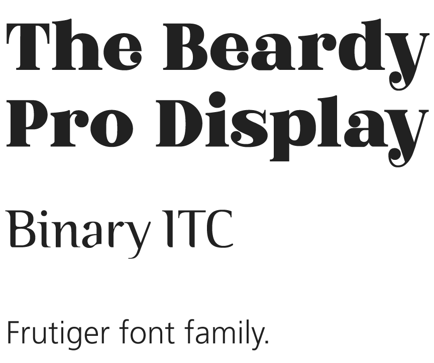
The Beardy Pro
PrimaryA high-contrast, editorial serif. Its bold strokes define the brand's premium voice. Use for large-scale headings (H1, H2). It requires ample whitespace—never crowd it.
Binary ITC
SecondaryA sharp, distinct serif acting as a bridge. Use for subheaders (H3, H4) and pull quotes. It adds a "tech-meets-elegance" vibe that prevents the brand from feeling too traditional.
Frutiger
BodyOur functional workhorse. Use for all long-form text and UI elements. It provides a clean, neutral foundation that allows the personality of the display fonts to shine.
Digital Fallbacks
Web SafeFor optimal web performance, use Playfair Display as a replacement for headers and Inter for body text. These Google Fonts ensure legibility and speed across all browsers.
Usage & Contrast
Proper contrast is essential for legibility. Below are the approved text color combinations for light and dark environments.
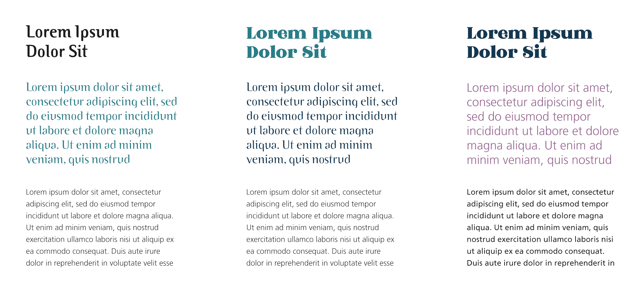
Light Backgrounds
Use Deep Navy or Slate Blue for text. Avoid pure black to keep the tone warm.
Dark Backgrounds
Use Cream or diluted Salmon/Mustard accents. Ensure body text remains highly legible.
The Color System
Our palette is divided into three strategic tiers. Click any color to copy its hex code.
Primary Colors
The voice of the brand. Used for logos, typography, and main structural elements to convey trust and depth.
Deep Navy
#1F3B53
Slate Blue
#2B5362
Ocean Teal
#328090
Plum
#9C6C91
Salmon
#FC9D69
Supplementary Colors
The warmth and humanity. Use these for backgrounds, illustrations, and supporting UI elements to soften the brand.
Mustard Gold
#D7A549
Sand
#E3C7A5
Sunshine
#FDBB3E
Rust
#D78225
Cream
#F6F6EE
Accents
The spark. Used sparingly for high-impact actions, errors, or key highlights. Never use for backgrounds.
Rich Black
#1B1B1B
Electric Coral
#F17181
Usage Warning
Electric Coral should occupy less than 5% of any visual composition.
How to Apply
Pro Tip: Follow the 60-30-10 rule. 60% Primary/Neutral, 30% Supplementary, 10% Accent.
The Foundation: Trust & Authority
The Deep Navy and Teal form the backbone of our visual identity. They should be the default choice for text, navigation bars, and footer backgrounds.
- Use Navy for headlines and body text.
- Use Teal for secondary brand headers.
- Use Salmon/Purple for subtle gradients.
- Don't use Salmon for long paragraphs.
- Don't mix Purple and Teal text directly.
- Don't use Navy on dark backgrounds.
Primary Application Example
Clean, professional, authoritative.
Corporate Heading
Lorem ipsum dolor sit amet, consectetur adipiscing elit.
The Support: Warmth & Structure
Our supplementary earth tones—Mustard, Sand, and Cream—humanize the brand. They bridge the gap between the cold corporate navy and the energetic pink.
- Use Cream (#F6F6EE) as the main page background.
- Use Mustard for icons or secondary buttons.
- Use Sand for card backgrounds/panels.
- Avoid using Mustard for body text (low contrast).
- Don't clutter the screen with too many warm tones.
Warm Card Style
Using 'Sand' for backgrounds creates a softer, approachable feel compared to stark white.
The Accent: Action & Urgency
Electric Coral and Rich Black are your tools for directing attention. They are high-energy and demand the user's focus.
- Use Pink for the primary CTA button.
- Use Black for max-contrast headings.
- Use Pink for error states or "New" badges.
- NEVER use Pink for backgrounds (vibrates).
- Don't use Pink for text unless it's a link.
Component Playground
See how changing the color hierarchy transforms the UI personality.
Dashboard Overview
Total Revenue
$24,500
New Users
+1,240
Active Alerts
3 Pending
Q4 Marketing Campaign
Launching the new rebrand strategy across all social channels. Utilizing the secondary palette for warmer engagement.